A preview of the billing experience. Two images are overlaid on top of each other: the foreground image depicts an accordion-style checkout flow with the business address step open, and the background image depicts the same experience with the payment method step open.

Billing experience

Mailchimp · 2018

Problem

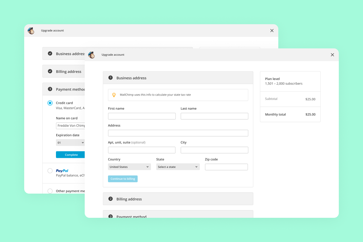
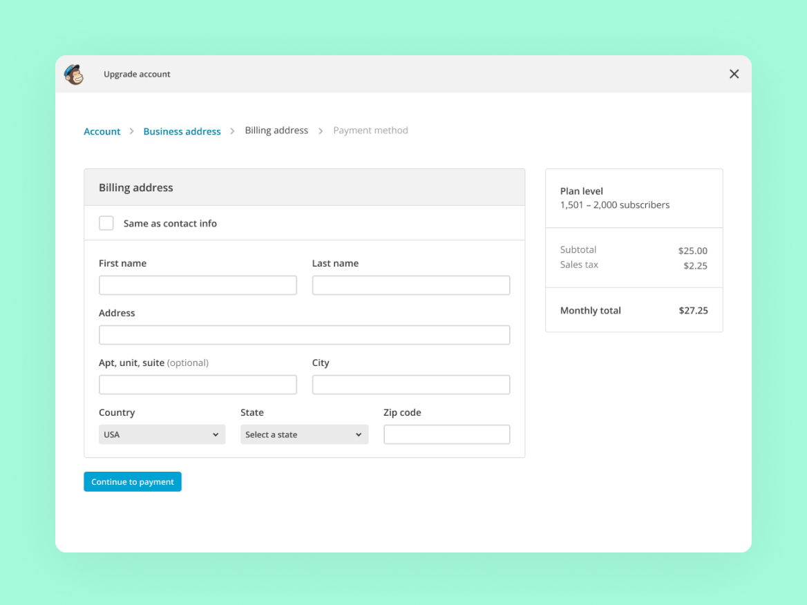
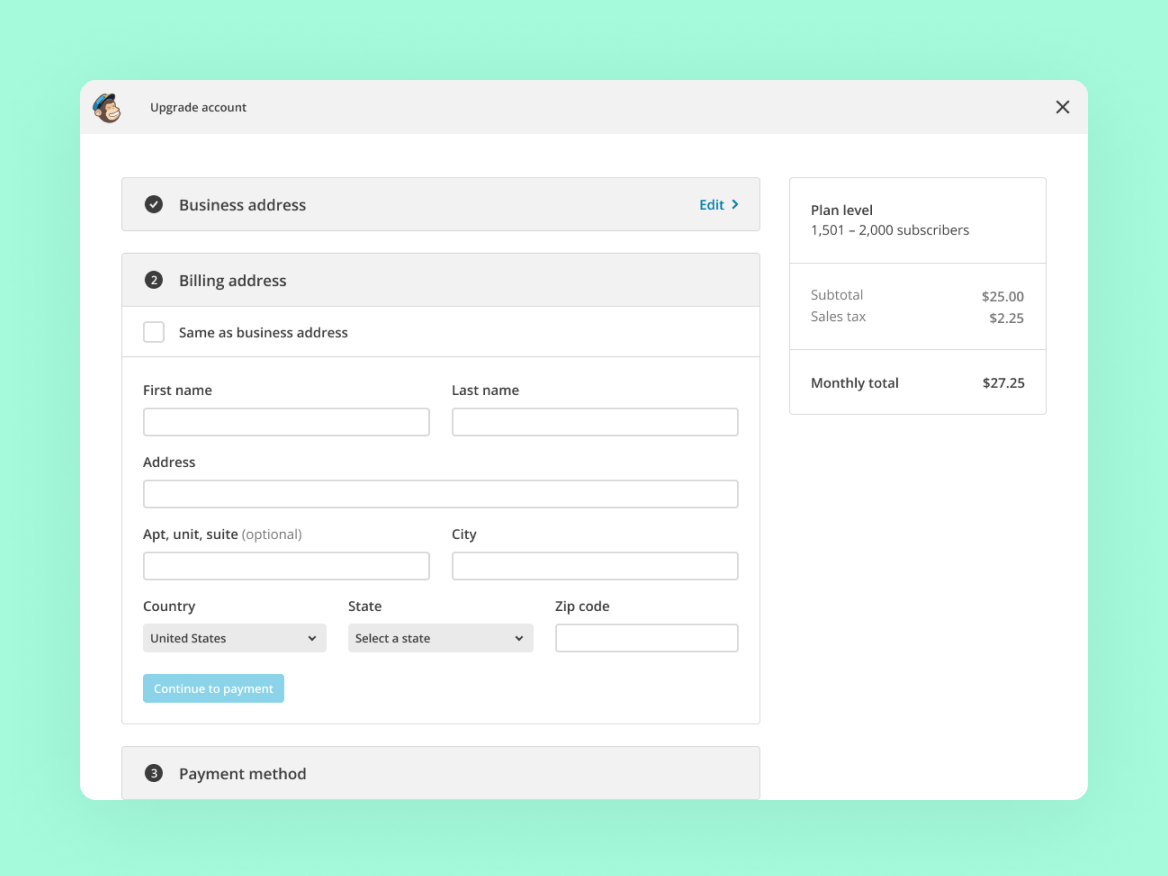
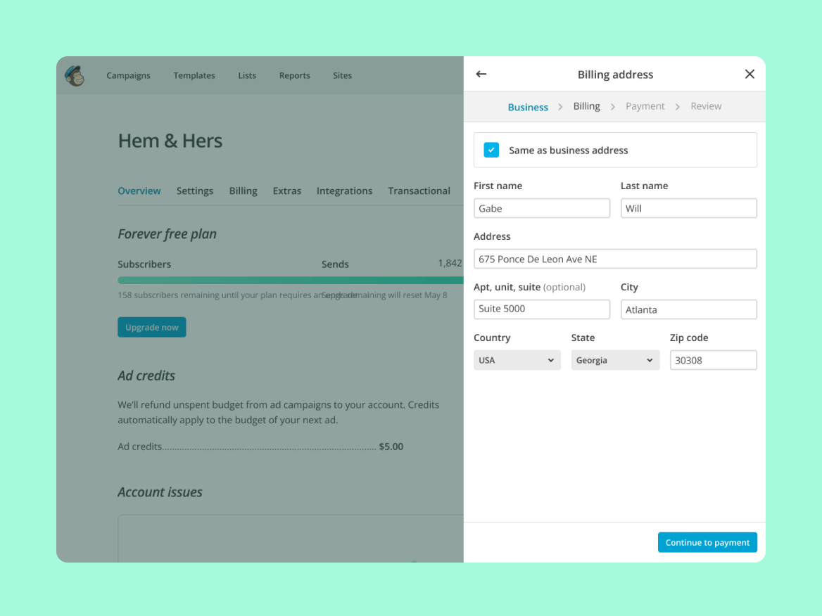
Mailchimp customers needed a way to upgrade their plan from any screen so they could access more of the platform without being pulled away from their current task. We aimed to do this by designing a modular interface that could be entered and exited from anywhere in the app, and by creating a focused experience that minimizes distractions and abandonment rates.

Solution

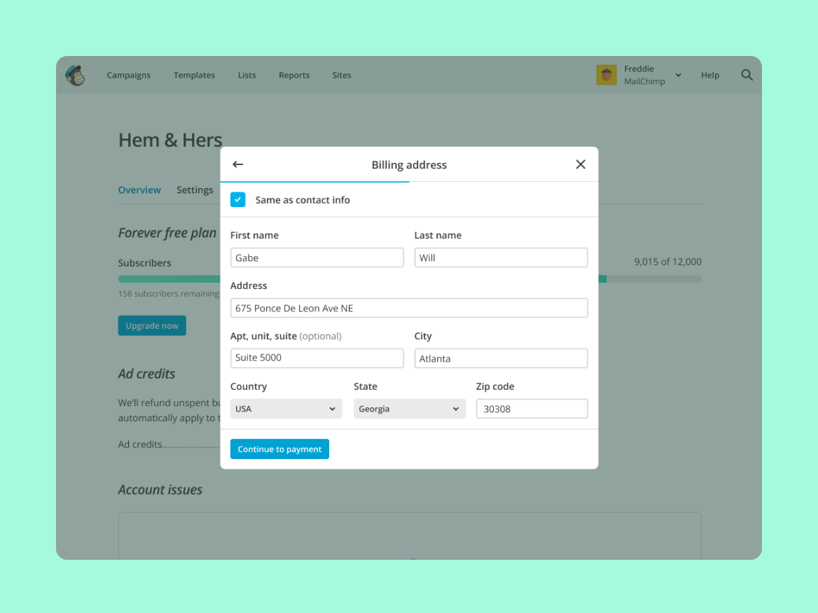
I was the first designer staffed to the billing team in the product team’s history, and unsurprisingly, there was a lot of experience debt to work through. I reviewed the feedback the team had been collecting internally for years, and combined that with competitive analyses and secondary research to inform different design directions we wanted to test.

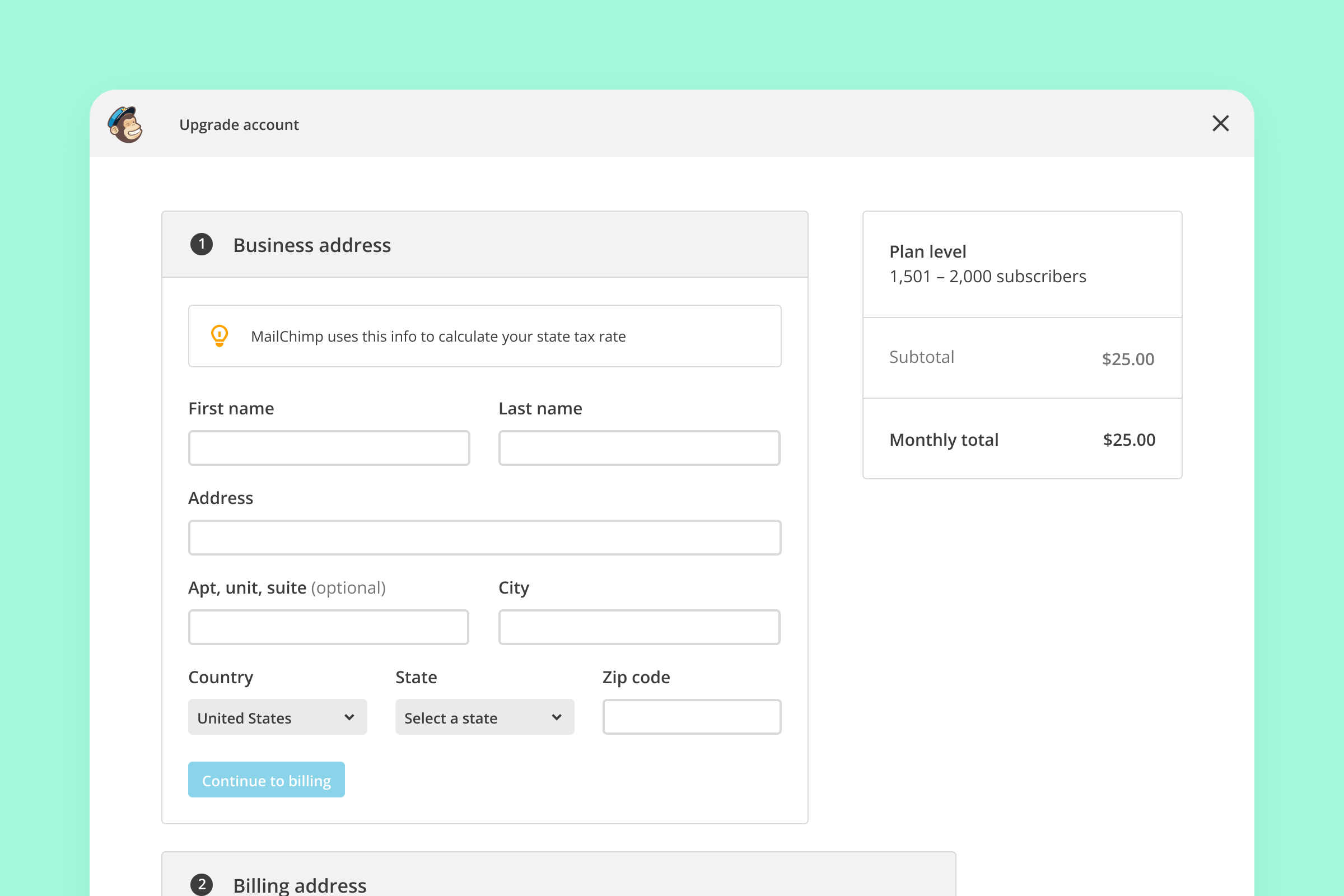
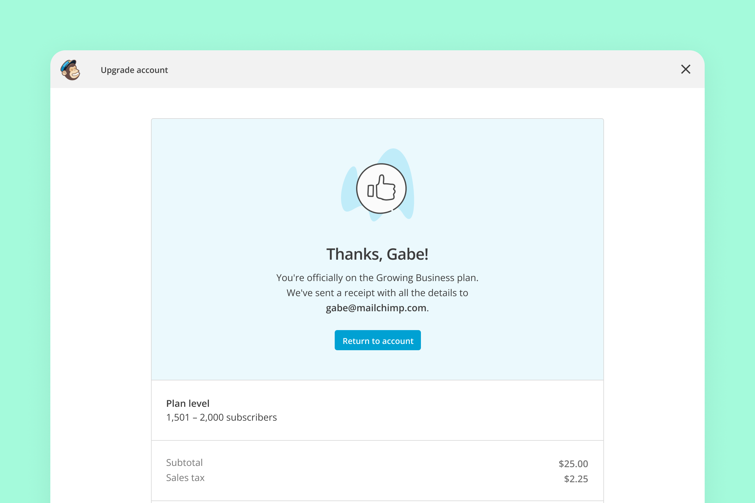
After exploring different modal presentations that allowed users to keep their background context, we landed on a fullscreen experience for the sake of minimizing distractions and keeping sellers in the subscription flow. I partnered with the research team to run a moderated usability test with Mailchimp customers, and found that most participants were able to complete the tasks without issue. After addressing the highest priority feedback, we rolled out the experience to Mailchimp’s customer base.

A full screen experience for upgrading an account, showing a billing address form with fields for name, address, and country, and a plan summary with pricing details and a button to continue to payment. A screen for upgrading an account, showing sections for business address, billing address, and payment method, with a billing address form including fields for name, address, and country, and a plan summary with pricing details.
A screen showing the billing address form in a sidebar, including fields for first name, last name, address, city, state, and zip code, with a checkbox for “Same as business address,” and a button to continue to payment, alongside the account overview. A billing address form within a dialog box, including fields for first name, last name, address, city, state, and zip code, with a checkbox for “Same as contact info,” and a button to continue to payment.
A screen for upgrading an account, showing the business address form with fields for name, address, and country, and a plan summary with pricing details.
A screen showing a confirmation message thanking the customer for upgrading to the Growing Business plan, with a plan summary and receipt details sent to the customer's email address.
A mobile screen welcoming a new hire, Ashley, with instructions to complete setup tasks such as reviewing profile and uploading documents, with a “Done” button at the top.

Next up

Square sellers wanted better support for onboarding their team and handling basic HR tasks. Learn how I designed a solution that guides team members from initial invite to first day on the job.