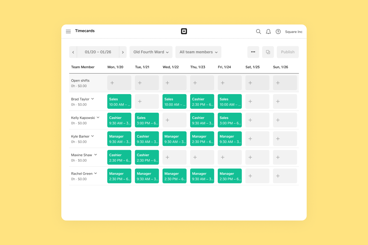
A preview of the scheduling product in Square Dashboard. A grid of shifts is visible that are assigned to various team members.

Scheduling

Square · 2020

Problem

Scheduling was one of the main feature gaps Square sellers cited as a reason they weren’t adopting Team Management, with around 25% of sellers using a third-party scheduling product due to Square not offering one. We wanted to close this gap by offering our own solution that would keep sellers in Square’s ecosystem.

Solution

We designed and built a scheduling product that lives across Square’s different surface areas. On the seller side, this included a scheduling grid where sellers can see their team’s availability, role, and more so they can assign shifts that work for everyone’s schedules. On the employee side, this included features for team members to view their upcoming shifts, set their availability, and swap shifts with coworkers.

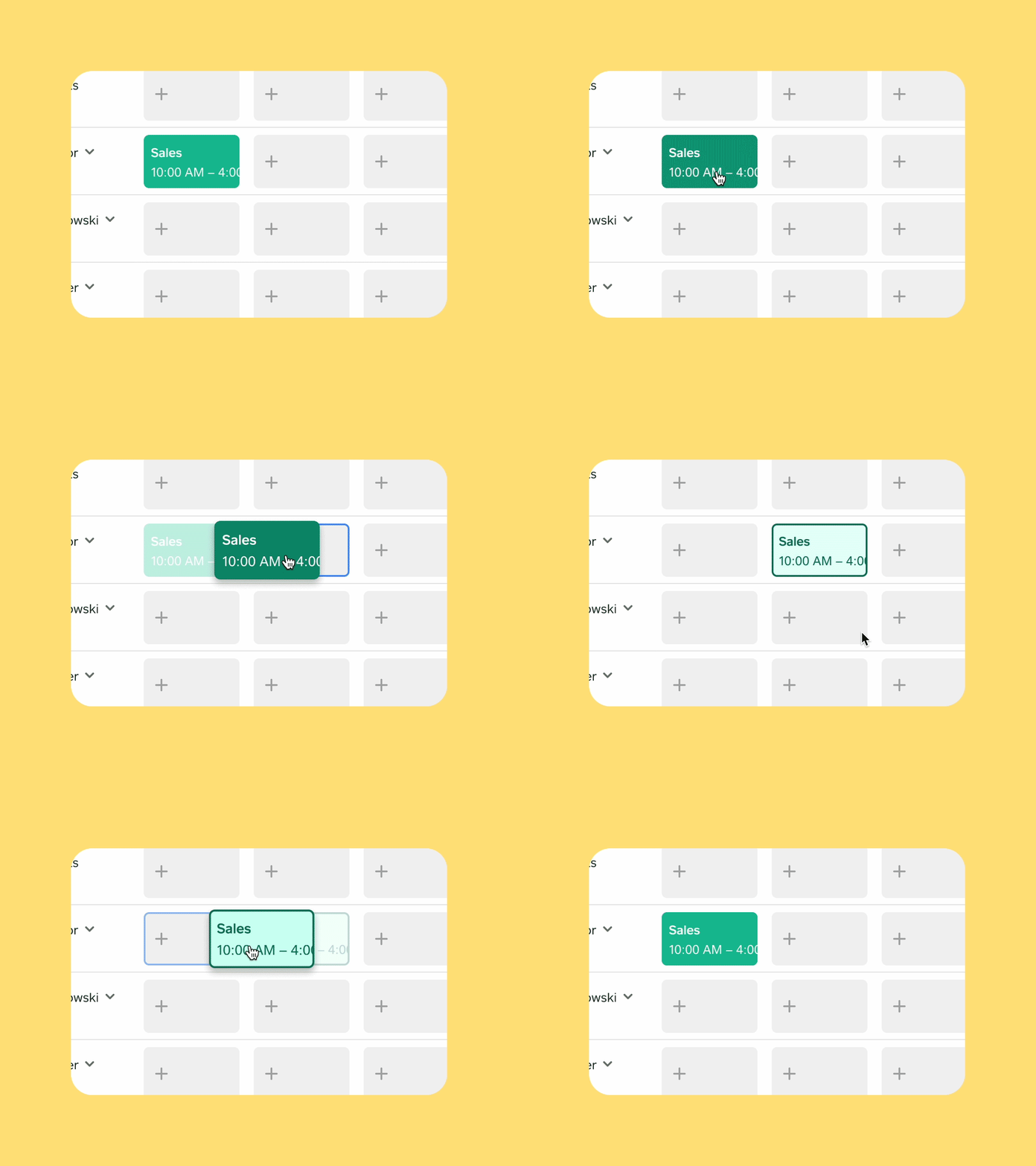
We knew our first release wouldn’t initially be competitive with other solutions that had been in labor management space longer, so we methodically pursued features that would offer sellers the most bang for their buck. We stayed close to user feedback by running a closed beta until the first release, and regularly holding interviews with sellers to make sure the product was resonating with them. Post-launch, we built several follow-up releases like drag-and-drop scheduling and time off requests to further round out the product.
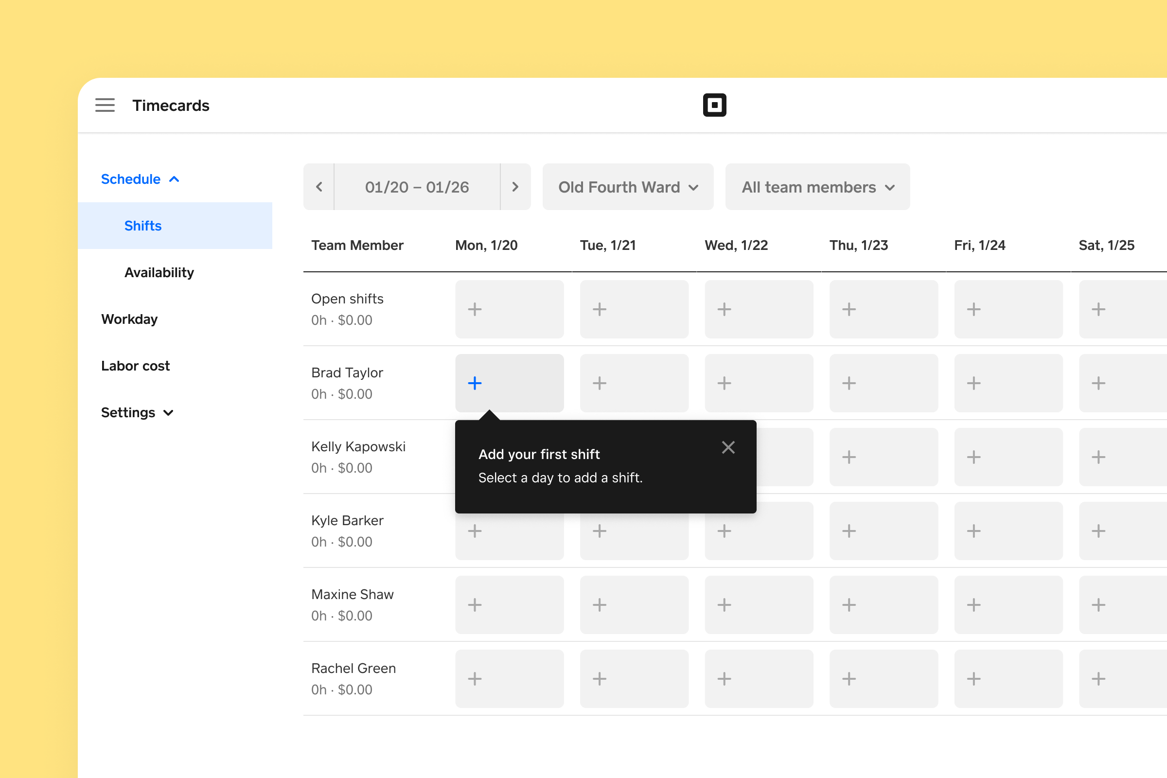
A screen showing the scheduling interface with a prompt to add the first shift for team members, displayed within a grid for different days and team members.
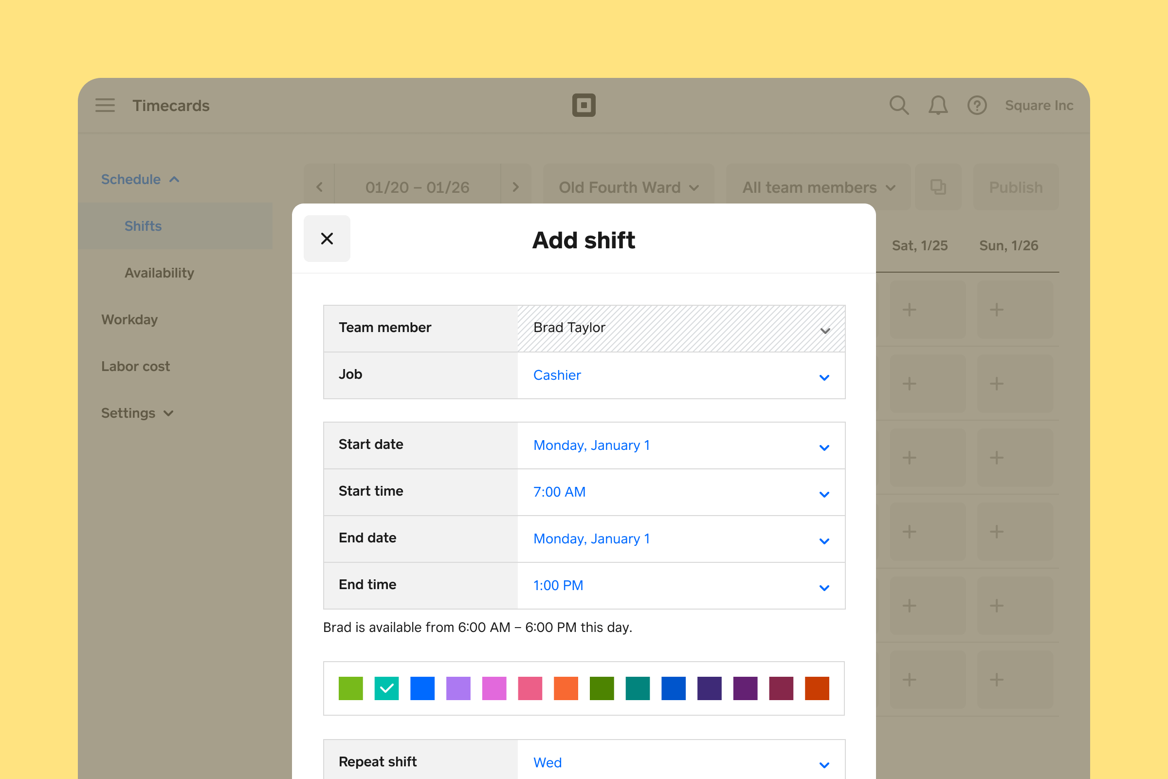
A screen showing the interface for adding a shift for a team member named Brad Taylor, with fields for job, start date, start time, end date, end time, and options for repeating the shift and selecting a color.
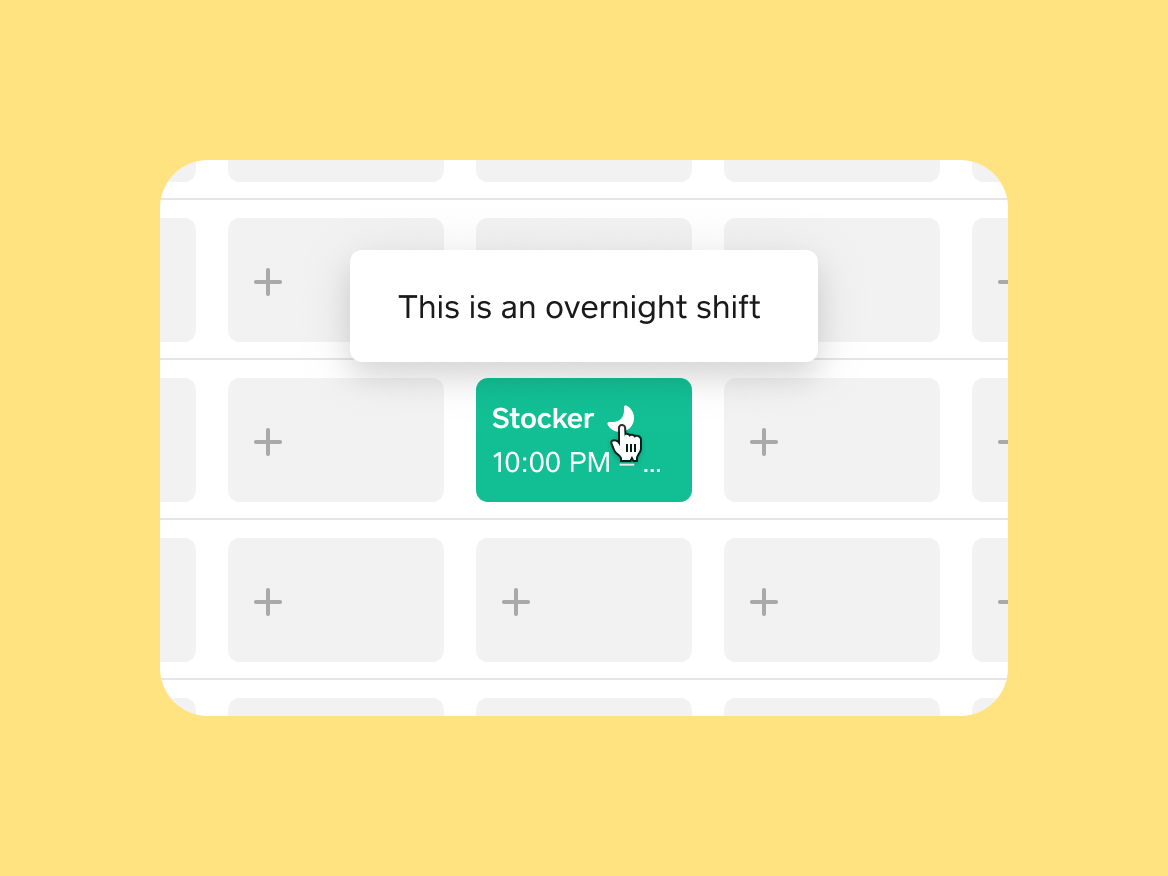
A moon icon as a visual indicator for an overnight shift for a Stocker role from 10:00 PM, highlighted within the scheduling grid. An animated GIF of a shift cell being dragged from one day to another day, and then back.
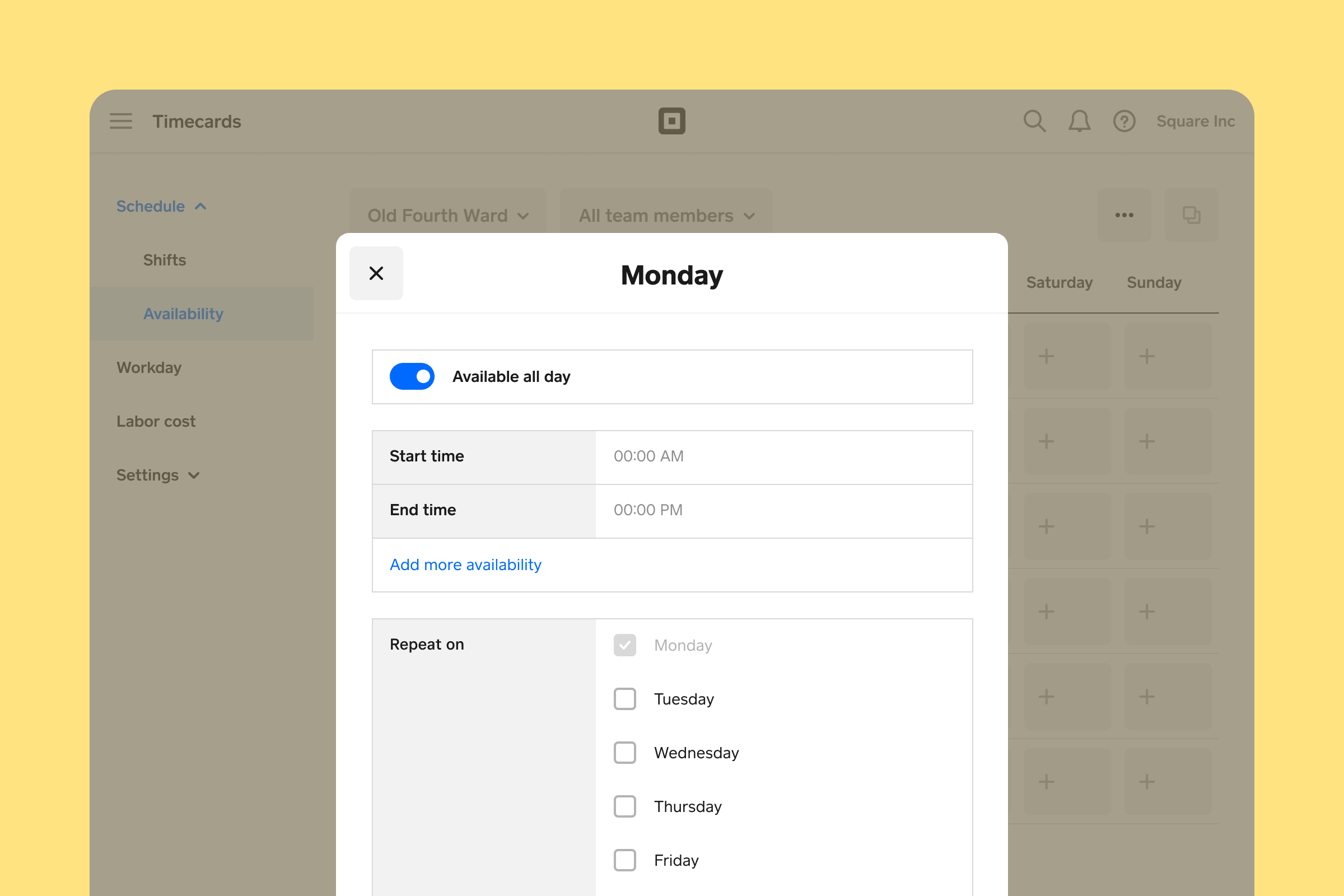
A screen showing the availability settings for a team member on Monday, with options to set available all day, start time, end time, and to add more availability, as well as to repeat on specific days of the week.
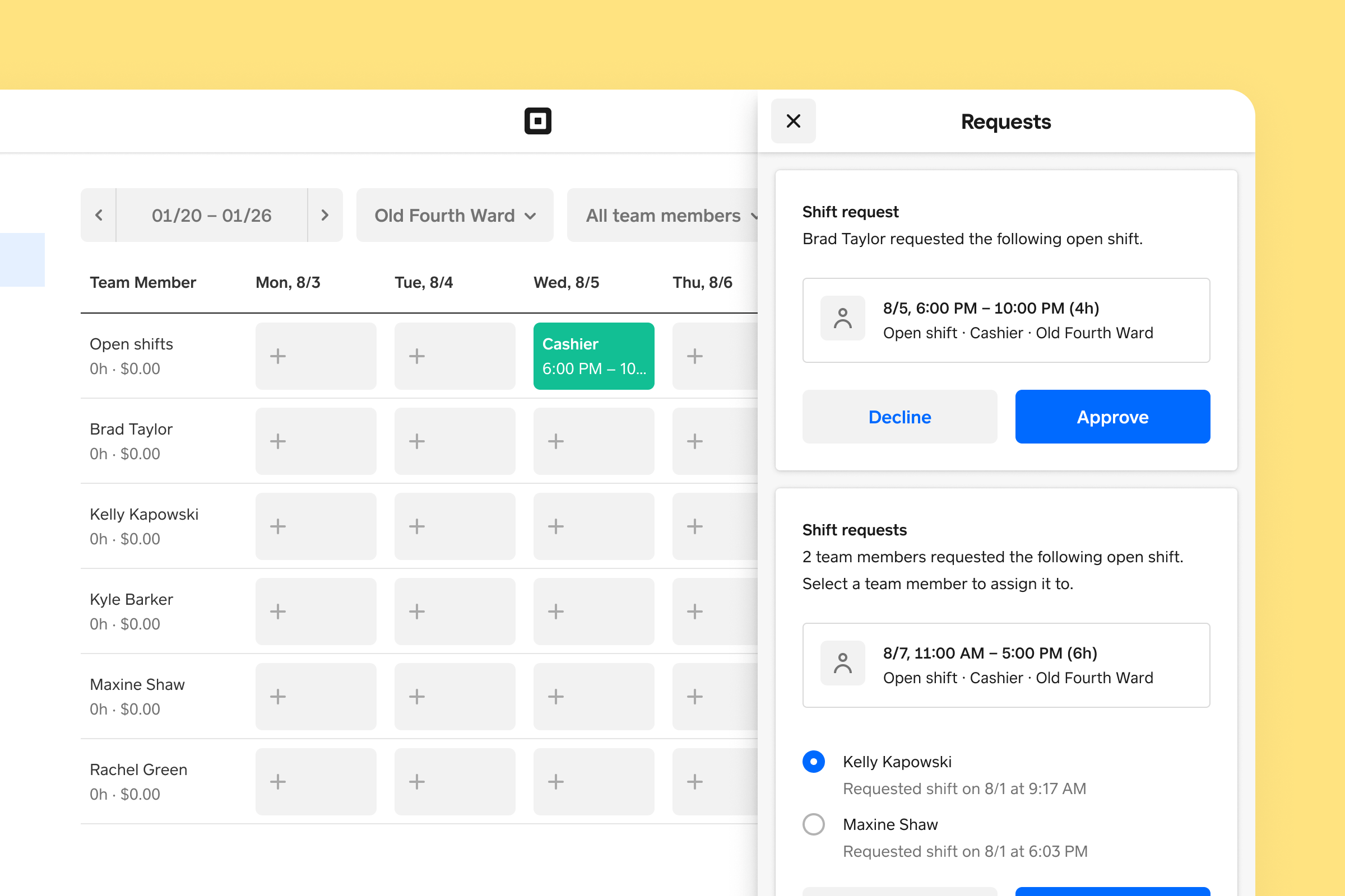
A screen showing shift requests, with a specific request from Brad Taylor for an open shift as a cashier from 6:00 PM to 10:00 PM, and options to decline or approve the request. The screen also shows other shift requests from team members.
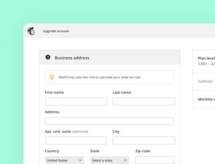
A screen showing the business address form for upgrading an account, with fields for first name, last name, address, city, state, and zip code, and a note that Mailchimp uses this information to calculate the state tax rate.

Next up

Mailchimp customers needed a way to upgrade their plan from any screen. See how I designed a focused, distraction-free experience that could be accessed from anywhere in the app.